Gerd Arntz and Isotype
Posted by wilfried van den elshout on
The Radical Woodcutter Who Taught the World to Speak in Symbols
Long before the stick-figure restroom signs, before the streamlined icons on your smartphone, before the universal language of pictograms became a global visual Esperanto, there was a German artist with a knife and a block of wood. His name was Gerd Arntz, and his clear-eyed, brutally simple figures would not only revolutionize the way we see data—they would try to democratize knowledge itself.
His story is inextricably linked with Isotype, the International System of Typographic Picture Education, one of the 20th century’s most ambitious attempts to create a world language of visual facts. But Arntz was no neutral information designer. He arrived at the drawing table as a radical political artist, and that fire never entirely left his impossibly crisp little men and women.
From the Coalfields to the Carving Knife
Born in 1900 in the industrial town of Remscheid, Germany, Arntz grew up surrounded by factories, smokestacks, and the organized working class. After serving in World War I, he gravitated toward the revolutionary ferment of the early Weimar Republic. He could have become a painter, but the medium he chose was as blunt and populist as his subject matter: the woodcut.
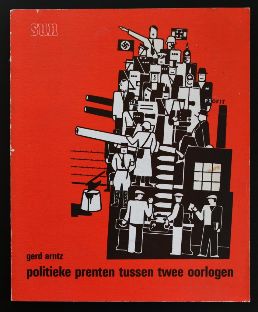
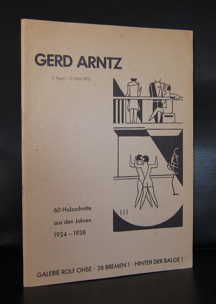
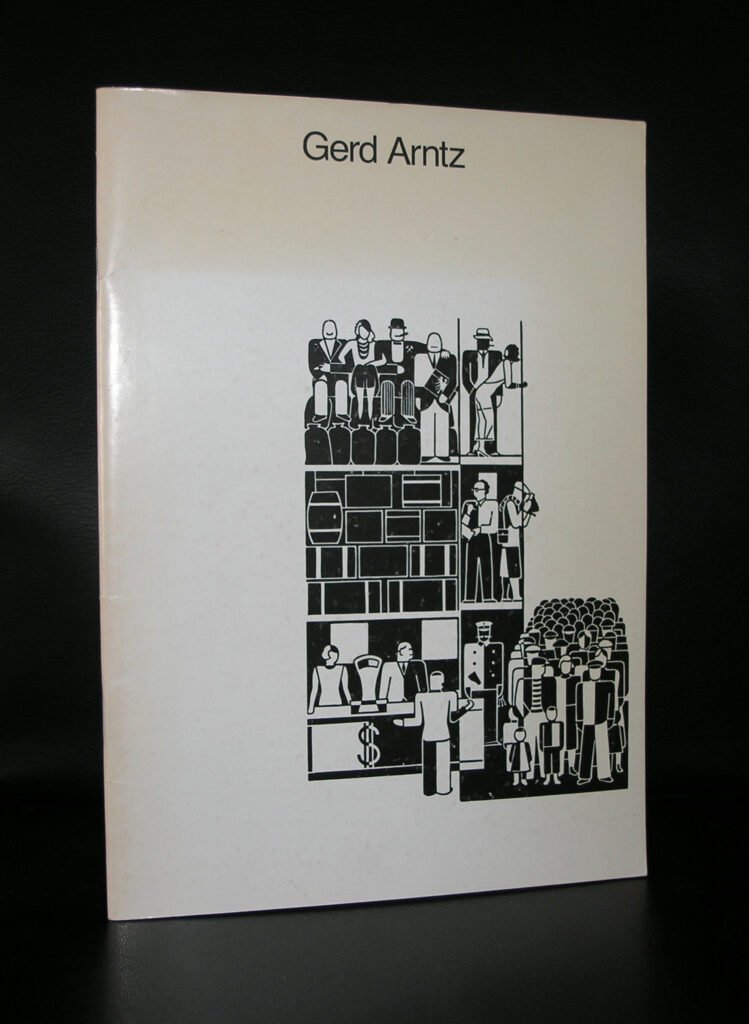
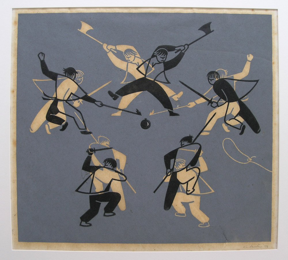
In the early 1920s, Arntz produced series like Twelve Houses of the Times and The Possession of the Means of Production. His woodcuts depicted class struggle not as heroic propaganda, but as an inventory of social types. A capitalist sits cross-legged, a fat cigar jutting from a featureless face, built from blocky geometry. A worker’s body is reduced to a sequence of tools and limbs. The unemployed man’s shoulders slope into a universal posture of defeat. Arntz was forging a visual grammar of essential forms, stripping the human figure down to an ideogram of itself. He was no longer drawing a particular factory owner; he was carving the concept of capital.
A Meeting in Vienna and the Birth of a Visual Language
In 1926, the Viennese philosopher, sociologist, and polymath Otto Neurath visited an exhibition in Düsseldorf and saw Arntz’s woodcuts. Neurath was in the middle of his own revolution. At the Social and Economic Museum in Vienna (Gesellschafts- und Wirtschaftsmuseum), he was wrestling with a fundamental problem: how do you explain complex social and economic facts—housing shortages, mortality rates, migration patterns—to a largely illiterate, working-class public?
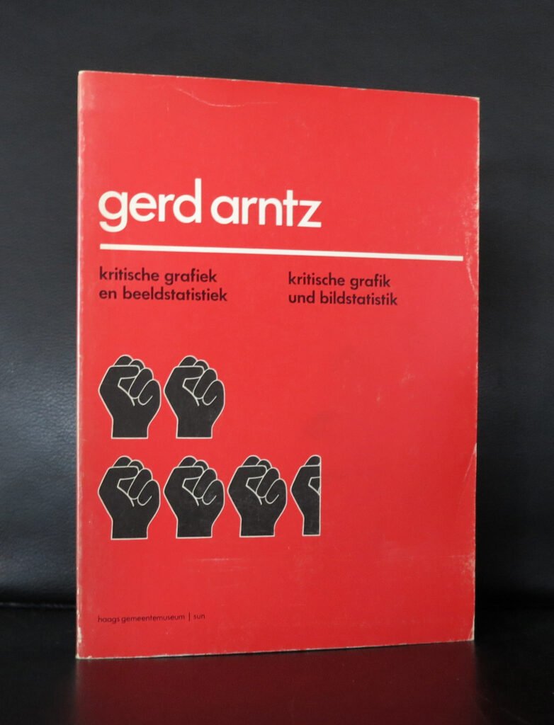
Neurath’s motto was “Words divide, pictures unite.” He had already developed the “Vienna Method of Pictorial Statistics,” using rows of identical symbol-figures instead of bars on a chart. To show 50,000 automobiles, you didn’t draw one enormous car; you drew five repeated car-symbols, each standing for 10,000. The eye could count quantity at a glance. But the existing symbols were inconsistent, often over-illustrated, lacking the brutal, immediate clarity Neurath craved.
In Arntz, Neurath recognized a kindred spirit who had already solved half the problem on his own. Arntz’s woodcut figures were already simplified to their communicative core. In 1929, Neurath invited Arntz to Vienna to become the head of the graphic department. It was the beginning of a partnership that would systematize the way the modern world uses icons.
The Transformer, the Tailor, and the System
Arntz’s official title was “graphic transformer.” In the Isotype method, raw data first passed through a “transformer” of scientific content (often Marie Neurath) who decided the narrative and the numerical units. Then it came to Arntz, the visual transformer, who had to embody that data in a repeatable symbol, arranged in rows on a white field with almost no text.
His symbols were not designed in isolation. They had to work together as a family, obeying strict design rules. The figures were drawn in flat silhouette—never in perspective—to allow direct comparison. They all shared a consistent line weight, a uniform height, and a frontal or strict profile posture. Shading, color (when available), and detail were kept minimal; only the attributes mattered. A “worker” carried a hammer or wore a flat cap. A “bourgeois” donned a top hat. “Unemployment” was a man slouched on a bench. “Marriage” was two simplified profiles peeking out from a single shape.
Arntz drew over 4,000 such pictograms for the Isotype project. They covered everything from “motorcycle” to “coal production” to “tuberculosis death rate.” Every symbol was a tightrope walk between lifeless abstraction and too much individuality. The symbols for nations are a masterclass in concept: not a detailed map, but a single soldier figure carrying an identifying weapon or wearing a characteristic helmet. A tiny shift in silhouette—a pickaxe instead of a briefcase—could define an entire social class.
Crucially, Arntz did not design these on a blank canvas with a stylus. He cut them from linoleum, using the very same techniques he’d perfected as a political printmaker. The lino-cutting process enforced an economy of line and a visual crispness that no pen could easily replicate. The Isotype man wasn’t just designed; he was carved into existence.
Art in the Service of Enlightenment
The results were deployed in groundbreaking exhibitions, books, and public posters throughout the 1930s. Charts like “The Social Ladder” or “The Army of the Unemployed” didn’t just display numbers; they told a story of societal structure using Arntz’s alignments of tiny, dignified workers and bloated, isolated capitalists. An Isotype chart was meant to be read like a sentence—subject, verb, object—built from Arntz’s vocabulary of symbols.
The political implications were obvious and threatening to rising fascism. While Arntz’s personal woodcuts could be fiercely satirical, his Isotype work aimed for a kind of factual, scientific neutrality—but the mere act of visualizing poverty and inequality in a language so brutally clear was an indictment. After the Austrian Civil War in 1934, the Nazi-aligned regime shut down the Social and Economic Museum. Arntz, whose sympathies were clearly with the left, fled Vienna for the Netherlands. Neurath and his team, including Marie Neurath, soon joined him in exile, first in The Hague and then in England.
Arntz stayed in the Netherlands, continuing to work on Isotype graphics and statistical projects for Dutch institutions, even under German occupation—he survived by shifting to harmless cultural-economic statistics. After the war, he continued producing information graphics with the same rigorous principles, his work growing more abstract and minimalist. His later linocuts returned to more personal, sometimes philosophical themes, but the clean, universal language of Isotype had already broken free.
The Legacy of the Modern Icon
When Otto Neurath died in 1945, and the movement’s institutional strength waned, Arntz kept the flame alive quietly from his home in The Hague. He never became a household name. Yet his visual DNA is everywhere. The 1972 Munich Olympics signage by Otl Aicher, the standardized stick-figure of the American Institute of Graphic Arts (AIGA), the airport toilet symbol, the interface icons on your phone—all owe an enormous conceptual debt to Arntz’s carved figures. Designers today speak of flat design, two-color silhouettes, and simplified human shapes as if they are recent innovations, but Arntz was doing it a century ago with a level of social commitment that few contemporary icon sets can claim.
What makes Arntz’s story so compelling is the dialogue between his radical art and his systematic design. He was a constructivist with a heart, an artist who believed that a perfectly proportioned symbol of a worker could be as beautiful as a painting—and far more useful. In a world drowning in complex data, his legacy asks us a simple question: if a picture can be a word, then who gets to speak, and who gets to be seen?
Next time you glance at a door sign and instantly know whether to push or pull, spare a thought for the German woodcutter who fled fascism with a suitcase full of linoleum blocks, determined to teach the whole world to read one clear picture at a time.
www.ftn-books.com has some very interesting titles on Gerd Arntz.
Share this post
- Tags: Gern Arntz, Isotype